
New Portfolio, New Me
I started my coding era building my first portfolio website, and I will say that it has been quite a journey. Every new portfolio, is a new me.
The predecessor
The previous portfolio website was made all the way back in 28th January 2025 - for High Seas. The overall design was inspired by invoices and paper (I got no clue what was on my mind at that time), and to make it look better, I added a soft concrete texture on the background so it looks like the website is a long sheet of paper on top of a concrete table that was questionably sized. To make it look more like an invoice, I even included a QR code leading to the website (the idea was so that visitors could scan it on their phones?). I even used the default mono font to relate it to me being technical and that somewhat worked.
The website’s design has mixed reviews - some mentioned it as pleasing to look at, some “fuck with it”, and others mentioned that the website looks boring and dull. Regardless, I believed that design resembled me best at that moment. I do not care much for what people thought of me, whats important is I stay true to myself.
Below is a screenshot of how it looked:
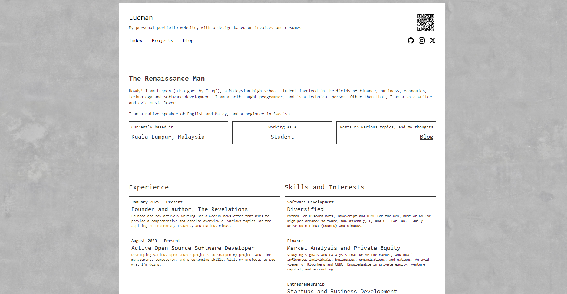
This design became my frontface on the internet for roughly 10 months.
The design overhaul
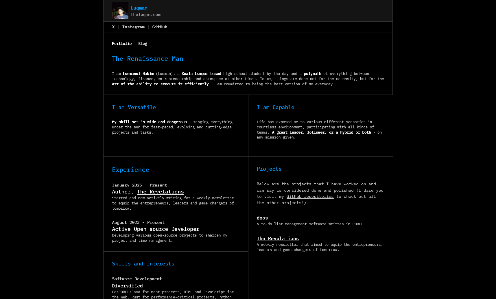
I’ve attempted multiple times on a design overhaul, and this time, I finally figured it out. The website was designed based on the previous iteration, hence the noticeable similarities such as the layout of the contents (projects on the right, experience/skills on the left). Most of the content was also recycled from the predecessor.
The theme is now dark, no more lighy, featuring that rgb(0,157,255) colour as the accent with different shades of gray complimenting the design. Additionally, the frames are now joint, forming a technical, seamlessly-integrated look and feel inspired by terminal user interfaces (TUIs). Other sources of inspiration was modal.com/gpu-glossary, ibm.com, and the portfolios of Ansub Khan and Matt Rothenburg. Recently, I have started to prefer the IBM Plex Mono font over the Jetbrains Mono font previously used - it looks more refined and aesthetically-pleasing in my opinion.
In addition to the new appearance, it is also built in relation to the blog - they both share the same design, theme and even styling. The only difference both websites have is the contents, as well as the blogging features (categories, _posts, etc.) that is only found in the blog.
Below is how the current portfolio looks like:
How things will be moving forward
Moving forward, minor changes will be made on the website as time goes by, but a complete overhaul/redesign is no longer expected. This website resembles my long-term design and philosophy, therefore I expect this design to remain somefor quite sometime - at least until late 2026, but we’ll see.
Thanks for the read, and I’ll see you when I see you next time!